Parisian Design Trends
Streetwise Inspiration
Vintage chair @isabelmarant Paris Men's Store; Photo Credit: Barbara Schmidt, studiobstyle.com
By Barbara Schmidt, studiobstyle, inc.
It goes by so fast. Ten days in Paris isn’t really enough is it? The street life, the food, and the shopping are all so delicious in detail and design. Everyday design appears in all aspects of life from bakeries to parks to retail to hospitality. Here are five design trends that caught my eye:
Dewi van de Klomp utilitarian foam sculpture @isabelmarant in the Paris Men’s store: Photo Credit: Barbara Schmidt, studiobstyle.com
Upcycling
Years ago when I visited Berlin, I saw all sorts of boutiques with upcycled goods. The trick is not just upcycling, it’s also creating a product someone wants to buy.
When I happened upon the new Men’s Isabel Marant store in the haute Marais district, I saw several vintage pieces that caught my eye. The store is just months old now showing the latest pastel spring collection hung across window fronts.
This black chair for one was something that drew me into the store. But against the far wall was this display made from foam packing material created by designer Dewi van de Klomp.
This got me thinking about all the cardboard we recycle. Just last Friday alone, I must have recycled four or five boxes. Our company recycles cardboard, but is there more that can be done with this material? Upcycling is a strong trend and will get stronger as climate change forces us to consider our “trash” habits.
The store manager chatted with me for a bit about all the planning and inspiration that went into the store itself. Perched on a triangular corner this location gets a lot of walking traffic. Great conversation, great inspiration from one of our favorite designers - Men’s and Women’s Isabel Marant.
Place setting @merci-merci in Paris: Photo credit Barbara Schmidt, studobstyle.com
Ahead of the Curve
While I was shooting our next fashion project, I kept hearing about this store “Merci”. The photographer and the hair and make-up artist kept saying you need to go there. Finally on our second to last day, we made it over to that neighborhood.
Merci is much like a curated Anthropologie meets museum shop. There was pottery, table linens, stationery, new clothing, vintage clothing, bags and backpacks, jewelry, etc.
The store itself was very busy, and there was a prop stylist returning items from a photoshoot while I was there. These are my people!
I did end up purchasing some pottery that will be just featured in our next editorial. Note the rounded-edge rectangle plates in the photo. I didn’t purchase these, but they are on trend for sure and are available online. Rounded corners are appearing everywhere--including on mirrors, cabinetry, and furniture pieces.
I also brought back a few journals for our design team. Merci has three restaurants attached to the shop and is located between the 11th and 3rd arrondissement. Definitely a great way to spend an afternoon.
Shower Lighting @courdesvosges Photo Credit: Barbara Schmidt, studiobstyle.com
Show me the Way
Sometimes the most subtle idea is so smart we wonder why it didn’t happen earlier. Here we are with both baseboard and floor lighting at Cour des Vosges. All around the bathroom and water closet there were small lights mounted either in the baseboard or on the floor. Even in the shower there were these lights mounted on the lower wall.
I didn’t even notice them at first, and then later, when they came on as I walked into the bathroom at night, I thought--that’s genius. The light cuts across the floor just 4-5 inches above the floor boards.
Especially when you don’t really want a jarring light right at your face because it’s early or late, this is a great solution. It was so pleasing, I took pictures everywhere to remind me to add this type of lighting into my next interior design.
"Clouds" Ligne Roset Sculpture Photo Credit: Barbara Schmidt, studiobstyle.com
Geometric Biomimicry
Have you noticed the change in shapes lately? Geometric tiles and artwork are so popular and some say it comes from biomimicry--the duplication of elements or systems from nature to create design or artwork in the home.
I was shopping at the BVH Marais department store and came upon a whole section of Ligne Roset. This beautiful art piece was hanging on the wall, and it reminded me of current tile trends. 3D geometric duplication is like snowflakes or crystals only this piece is created out of felt. Who knew I’d find Ligne Roset on my way to the French lingerie department?
BVH Marais is huge by the way. It has floors and floors of merchandise, and an entire website full of European goods that can be shipped to the states. Watch for more biomimicry design to appear in all aspects of design.
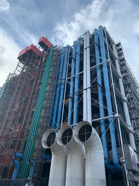
Pompidou Centre on a recent trip to Paris; Photo credit Barbara Schmidt, studiobstyle.com
Where’s Waldo?
What is up with all the hide and seek or iSpy type of content? I’m seeing it everywhere online - LinkedIn, Facebook, etc. It seems like finding something that’s hidden is a whole new story genre. I thought about this recurring theme standing next to the Pompidou Centre in Paris.
I spy giant air vents. They are like periscopes. The idea of “sneaking a peek” feels intriguing doesn’t it? It’s one of the most popular tags on Instagram too.
The Pompidou air vents are proverbial periscopes to a new idea, a new land or a new perspective. That’s what Paris is too many visitors--a new view to design.
Now 40 years old, the Pompidou Centre was built with the inside workings of the building on the outside. The idea of inside workings of the building left on the exterior allowed the building interior open for events, galleries and displays. What is inside? Here’s where you can get a sneak peek:
For more design ideas see our Shop Now pages on our website and follow our Instagram stories.


