Kitchen Anthology
Key Elements in Today’s Kitchen Design
Custom Kitchen Designed by Barbara Schmidt, studiobstyle.com; Photographer tnehottephoto.com; editorial feature @subzero-wolf.com; @showplacecabinetry.com; @wilsonart.com; @jeffreycourt.com; @weathershield.com; @karndean.com
Floorplan: Open Format and Natural Light
As time goes by we are seeing kitchens become more and more like open workspaces with hidden appliances and hidden storage. We are seeing grand formats where the kitchen is completely wide open to the outside even in more northern climates.
That is because of the biggest trend in home design - oversized patio doors. These Weather Shield doors and windows are energy efficient and very easy to operate. The door install on this project and it took less than a day. By creating this outdoor patio area we are extending the kitchen to include outdoor space for entertaining.
My personally favorite window format is also featured here - the French casement. It’s a European inspired design that has a retractable screen. Open the the windows like a French door and then pull down the screen for a wide open view and protection from flying critters.
Custom Kitchen Designed by Barbara Schmidt, studiobstyle.com; Photographer tnehottephoto.com; editorial feature @subzero-wolf.com; @showplacecabinetry.com; @wilsonart.com; @jeffreycourt.com; @weathrshield.com; @karndean.com; @tapis-decor.com
Blended Style: Finishes and Door Configuration
In the past, we’ve seen perimeter kitchen cabinets one color and the island another color. Here we are blending two different door formats - the riser slab door style and the traditional slab drawer style. We also mixed in a traditional vertical slab door style as well.
We blended two Showplace Cabinetry finishes - the Licorice Groovz textured melamine for the lower cabinets and the Milan Cherry wood with truffle stain for the upper cabinets and shelves. Each door style is designed to be the right functionality for the space. For example, we have the upper cabinet doors lift up for ease of use because they are positioned higher on the wall.
Custom Kitchen Designed by Barbara Schmidt, studiobstyle.com; Photographer tnehottephoto.com; editorial feature @subzero-wolf.com; @showplacecabinetry.com
Ergonomics: Right Height Ovens and Refrigeration
It seems so obvious, doesn’t it? Placement of ovens side-by-side makes it so much easier to operate both of them. We know oven stacks came into being due to combining function into the same area.
In design, it is often times more cost effective to add on vertical height than it is to add lineal feet. That may be why oven stacks became so popular - it was adding on lineal feet or square footage to a design to add functionality.
It wasn’t until we were working on another kitchen with an extremely tall client that I realised how awkward oven stacks can be for some homeowners.
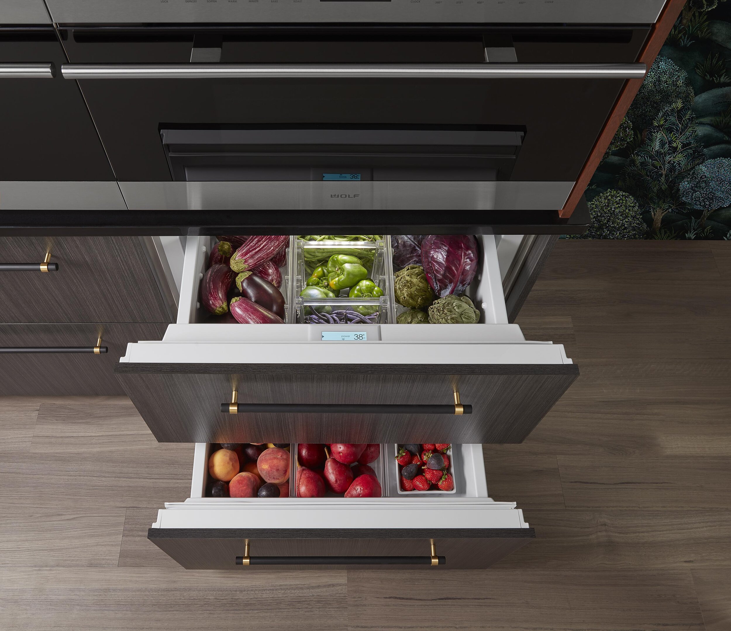
Here we installed two Wolf ovens, one convection/steam and one convection to double the warming capacity of the kitchen. Note the built-in nature of the countertop with the oven units placed on top of the counter slightly pushed back off the countertop edge to allow a finished edge all around this bank of cabinetry.
We also featured six Sub-zero undercounter drawer refrigerators or refrigerator/freezers in this unusual format. Not only would this work for ADA requirements it also can work better with children’s reach while they are helping in the kitchen. As a designer I love opening up the vertical space for more natural light and more countertop work areas.
Custom Kitchen Designed by Barbara Schmidt, studiobstyle.com; Photographer tnehottephoto.com; editorial feature @subzero-wolf.com; @showplacecabinetry.com; @wilsonart.com; @jeffreycourt.com; @weathershield.com; @karndean.com; @tapis-decor.com,; gallery360.com
Countertops: More Square Footage for Creative Space
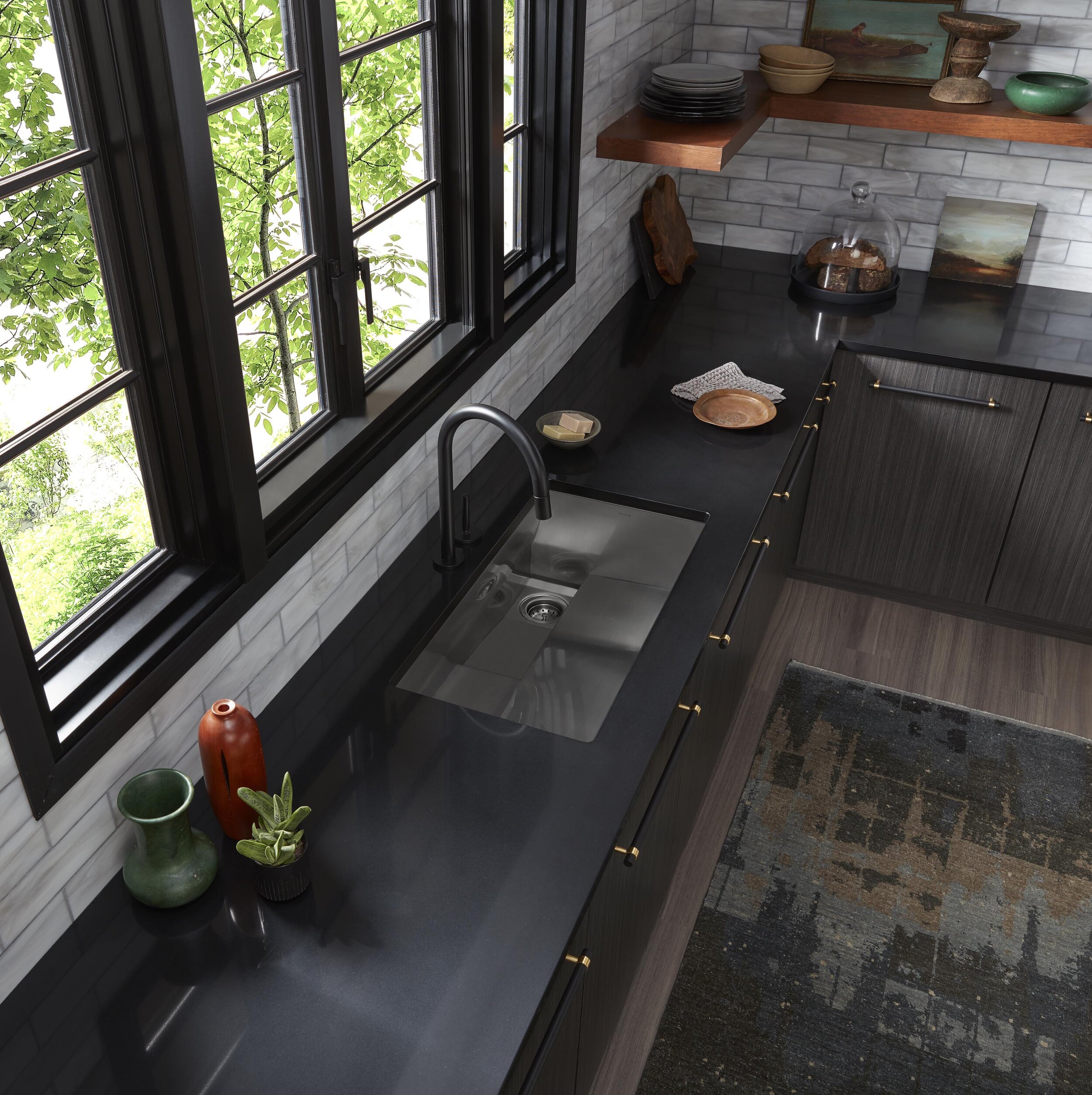
When designing a kitchen we think about zones or work areas. It’s helpful to have a countertop near the dishwasher. Here we featured the Cove dishwasher to the left of the sink. We also kept countertop areas open to the left and right of the range.
We chose Wilsonart Vesuvius Quartz because of it’s cool-toned charcoal black background. The pattern has some subtle mica-like flecking that captured the light spilling in from the kitchen windows.
Above the drawers there is also an open countertop area to set items down while pulling them out or placing them into refrigeration or the freezer. The consistency of these open countertop areas created an even wider open creative visual space for the homeowner.
The other design element that we wanted here was to pull together the lower cabinetry with the countertops as one visual element. This allowed us to contrast the backsplash tile and pull in the cherry wood color over to the other side of the kitchen.
Custom Kitchen Designed by Barbara Schmidt, studiobstyle.com; Photographer tnehottephoto.com; editorial feature @jeffreycourt.com;
Sustainability: 100% Recycled
Perhaps the biggest trend we will see this year is a big push for sustainable green products. Climate change is affecting all of us and there is a huge push to recycle and upcycle materials and products in our designs.
The backsplash we chose is 100% recycled glass from Jeffrey Court Tile. This backsplash is great for another reason as well. It’s a twist on the traditional subway tile that is starting to wane in popularity. The glass has warm and cool tones in subtle ribbons mixed into the variegated white background.
Barbara Schmidt, studiobstyle is a national recognized Interior Designer and Marketer for Home and Fashion brands including manufacturers and retailers. Her next speaking engagement will be January 22nd, at 9:00 at the National Kitchen and Bath Show as featured guest presenter for NKBA’s Voices of the Industry.


